Colors
Primary Palette
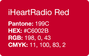
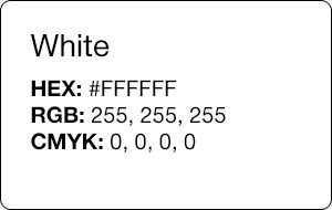
The iHeartRadio palette consists of three colors: iHeartRadio red, black, and white. The red, used in our logo, is the core of our brand identity and appears whenever possible for users to immediately identify the brand.


Paint Colors
Benjamin Moore Regal Super White
Walls: N319 Eggshell Finish
Ceilings: Flat Finish
Benjamin Moore Regal 2000-10 Red
Walls: N319 Eggshell Finish
Ceilings: Flat Finish
Benjamin Moore Exterior Ready Mix Platinum Gray
Walls: N319 Eggshell Finish
Ceilings: Flat Finish
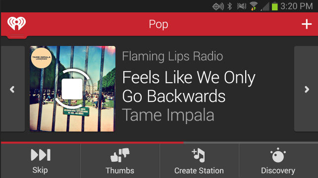
Home Entertainment
iHeartRadio for Home is designed to be on a dark background. We use black, white and gray for type and UI elements. Whites or device specific shadows are used for highlight states. Transparent blacks are used on top of photography. Use accents of white in its icons and text, delicately in contrast to engaging album art.


Web
The iHeartRadio red is used sparingly on Web. Transparent blacks with white type are used as alternatives to black on white. Light grays are used for dividers and sub-navigation to separate content. Occasionally for a button style that needs more gravity, we use blue (#2474c7).


Auto
Like mobile, Auto uses the red header when possible. It can have two different usages of color depending on the time of day. At night, the colors tend to use a darker palette, like Home Entertainment. This is to not distract from driving. Unique to Auto, there also exists a smartphone app, called Solid User Interface (SUI) that can be used to control wirelessly the built in dashboard interface of the car. Otherwise the design may be heavily determined by the car manufacturer.