Typography

Used for Android products
Includes mobile, wearable devices, Android Auto and Android Automotive

Used for Apple products
Includes mobile, Apple Watch, CarPlay and Apple TV

Used for Web and TV
Includes iHeart.com, Roku, Amazon Fire TV, and other HTML5 platforms
Typographic Scale
These are recommended guidelines and best practices for typographic scale across each platform. The largest and smallest sizes should be used sparingly.
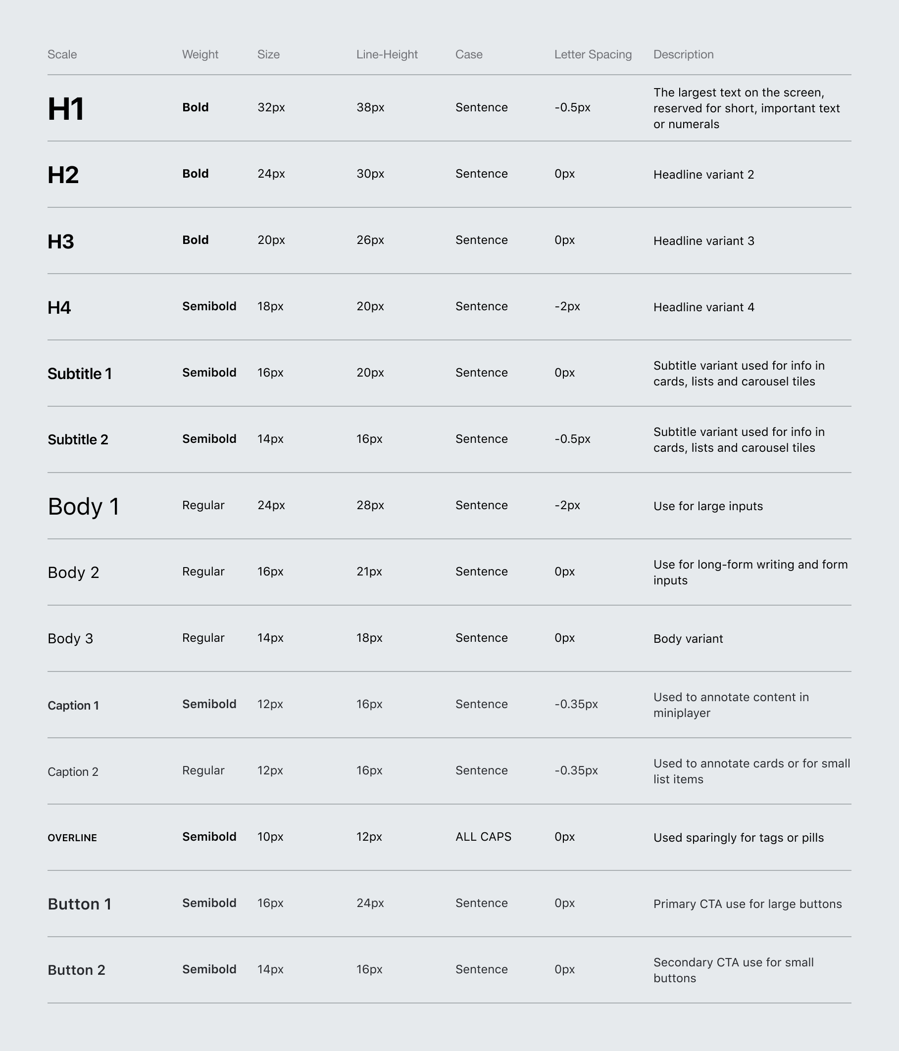
Mobile Type Scale
General fonts sizes used across our mobile apps. The sizes accommodate for both iPhon and iPad devices.
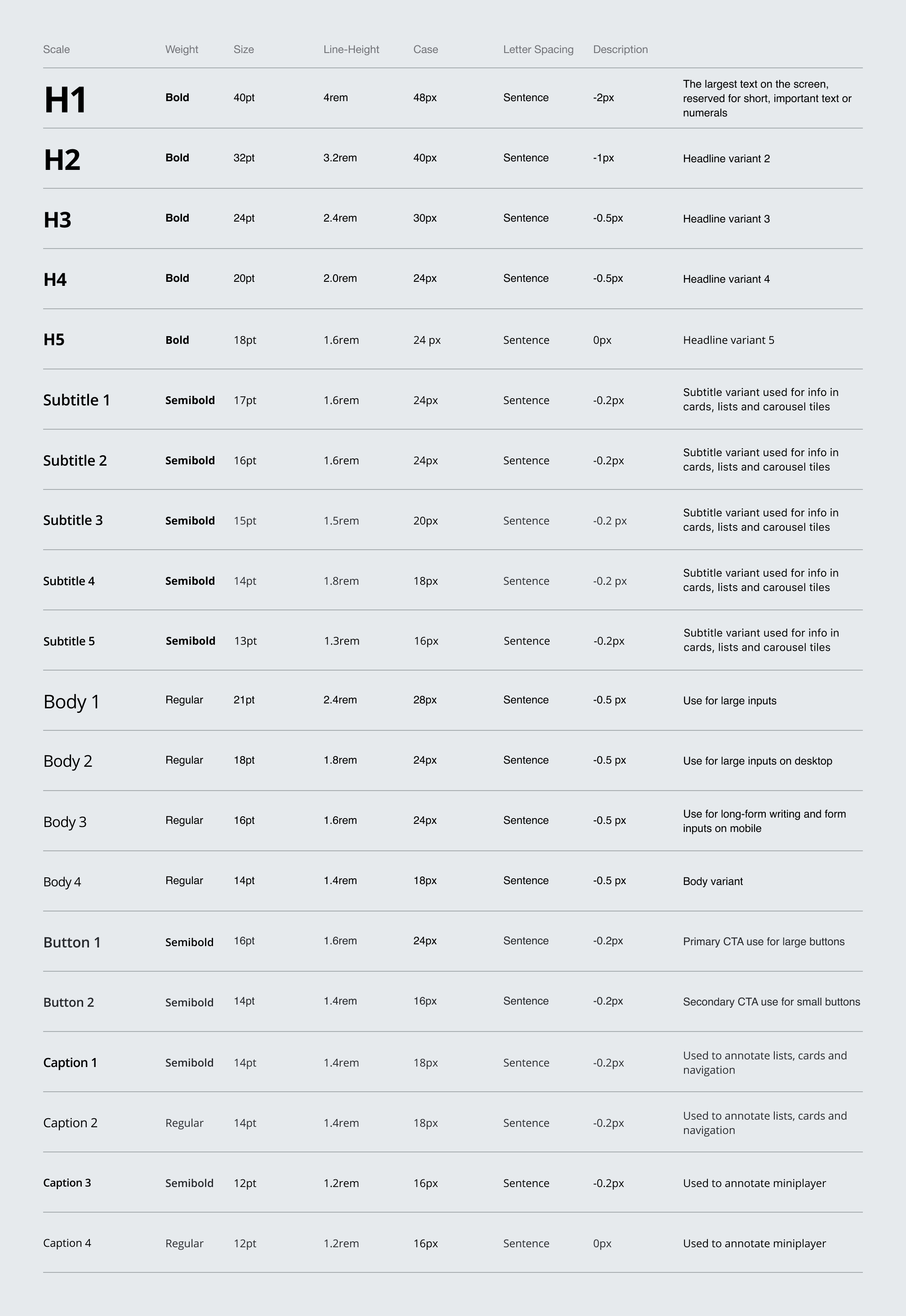
Web Type Scale
Web font sizes- simpler with a wider scale that accommodate desktop monitors, laptops, tablets, to mobile devices.
Home Entertainment Type Scale
A larger and wider scale is needed for Home because of the varying distances the display can be viewed from.

Wearable Type Scale
Because of the simplification and lack of content on watch screens, there isn’t a need for a wide hierarchy of font sizes.

Text Colors
These are standard type colors for light, neutral, and dark backgrounds. Text maintains a certain contrast ratio to ensure legibility, hierarchy and accessibility. Any text in the app should adhere to the following guidelines to ensure it meets accessibility standards.
